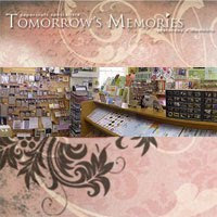
I am well know for buying stamps and not using them. They decorate my craft room shelves nicely but really I need to get them out and use them. I know stamping can be a bit daunting but it doesn't need to be. I decided to challenge myself and pick some stamps that I thought would fit with the theme of my photo. I picked ones that were not big in size, but that added a little something extra to my layout. Think of it as just adding another layer. Another thing that might help is to choose an ink colour that is more of a neutral tone so that it doesn't necessarily stand out and therefore there is less pressure on "getting it right". It also makes the stamping another element on the layout rather than a focal point.
I chose a yellow because there were hints of it in my photo, it added a little extra colour to my layout and it blended into the layout rather than standing out. This also meant that if my stamping wasn't perfect it wasn't going to be obvious, so taking away that pressure I mentioned earlier.
I then laid out my pieces roughly putting things where I thought they should go. I played around with the layout a bit and then once I was satisfied I added my stamping. I then went and secured all the pieces down.
I finished off my layout with some stitching.
Thanks for stopping by and I hope I have given you some tips that will encourage you to
add stamping to your layouts.
Happy stamping
Tracey - :-)


No comments:
Post a Comment